10 Best Principles of UX Design for Creating Exceptional User Experiences
In the rapidly evolving digital landscape, User Experience 10 Best Principles of UX Design has become a cornerstone for creating meaningful and engaging user interactions. A well-designed UX not only attracts users but also retains them, converting them into loyal customers. This blog post delves into the 10 best principles of UX design, providing essential insights for designers, developers, and businesses aiming to enhance user satisfaction and engagement.
Table of Contents
Problem: The Need for Effective UX Design
Statistics reveal the critical impact of UX design on user behaviour and business success. A negative user experience can lead to a significant drop in user retention and customer satisfaction. According to recent studies:
- 62% of users are unlikely to return to a brand’s website after a negative experience.
- 48% of users are frustrated with poor mobile experiences.
- 70% of customers abandon purchases due to poor UX.
Agitation: Consequences of Poor UX Design
Poor UX design can severely affect a business’s bottom line. Users today expect seamless, intuitive, and engaging digital experiences. When these expectations are not met, it leads to:
- Increased bounce rates
- Decreased user engagement
- Lower conversion rates
- Negative brand perception
Solution: Implementing the 10 Best Principles of UX Design

By adhering to the ten best UX design principles, businesses can create digital products that are functional and delightful to use. These principles, backed by extensive research and expert insights, offer a roadmap to designing superior user experiences.
1. User-Centric Approach
Understanding User Needs
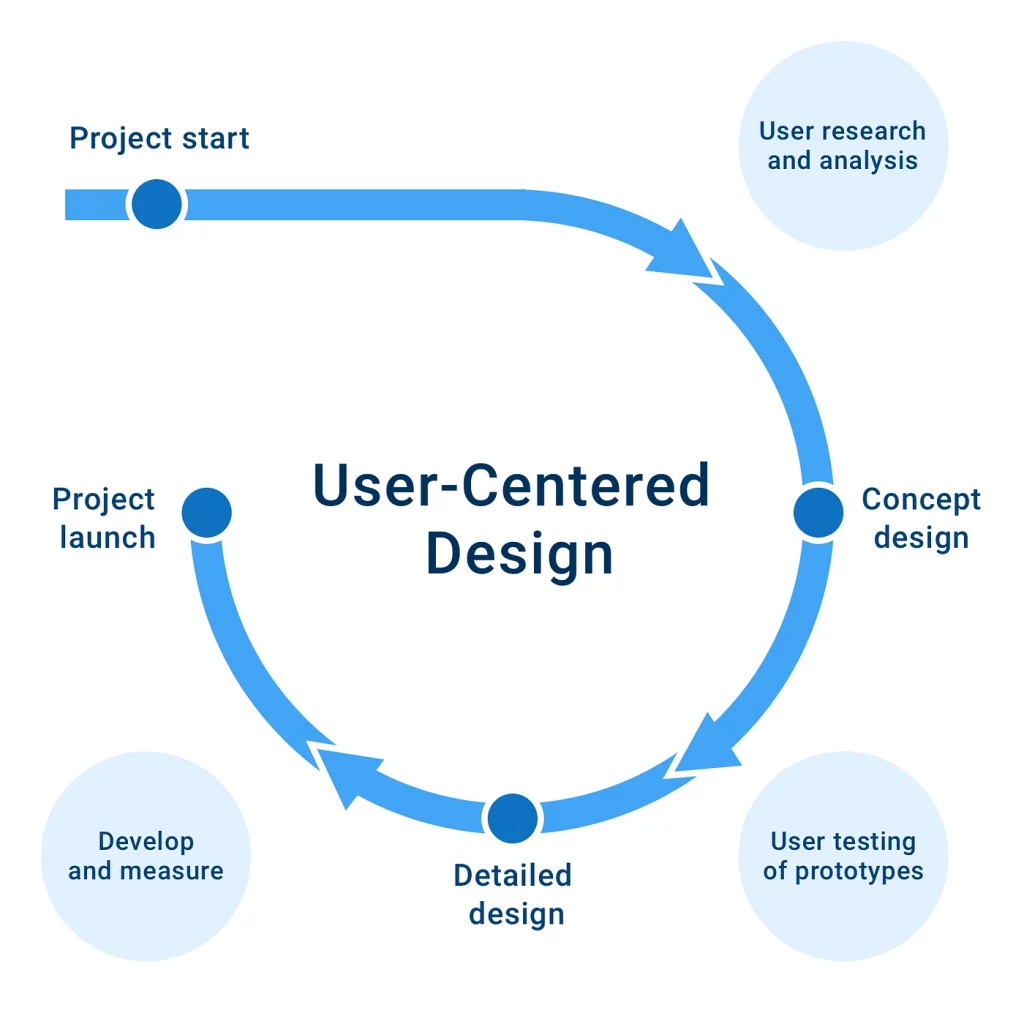
A user-centric approach is foundational in UX design. This principle involves understanding and addressing your target audience’s specific needs, desires, and limitations. Start by developing comprehensive user personas and realistic profiles of your key audience segments derived from user data and research. These personas guide design decisions to ensure they resonate with your users.
Case Study: Spotify
Spotify’s personalized approach is a prime example. By analyzing user behaviour and preferences, Spotify creates tailored playlists like “Discover Weekly,” significantly enhancing user engagement and providing a custom experience that feels uniquely personal.
2. Simplicity

Streamlined Interfaces
In UX design, simplicity is paramount. An uncomplicated, uncluttered interface, straightforward language, and intuitive navigation are critical to a positive user experience. This principle involves reducing the cognitive load on the user by minimizing choices and focusing on essential elements.
Case Study: Google
Google’s homepage exemplifies simplicity. Its minimalist design, dominated by the search bar and devoid of unnecessary elements, makes the user’s task clear and distraction-free, significantly enhancing usability and user satisfaction.
3. Consistency

Uniform Design Elements
Maintaining consistency across your design is crucial for a cohesive and intuitive user experience. This principle involves consistent colour schemes, typography, button styles, and visual elements across various pages and platforms.
Case Study: Apple
Apple’s ecosystem is a prime example of consistent design. The interface elements, aesthetics, and user interactions remain consistent across all devices, from iPhones to Macs, providing a seamless and intuitive experience.
4. Accessibility

Inclusive Design
Accessibility is a critical aspect of inclusive UX design. It involves designing products usable by people with a wide range of abilities, including those with disabilities. Adhering to the Web Content Accessibility Guidelines (WCAG) ensures your design is accessible to as many users as possible.
Case Study: BBC
The BBC website stands out for its commitment to accessibility. It incorporates features like screen reader compatibility, keyboard navigation, adjustable text sizes, and subtitles, making its content accessible to a diverse audience.
5. Usability

Functional and Intuitive Design
Usability is at the heart of UX design. It’s about making your product functional and easy to use. This principle encompasses a logical flow of information, clear calls to action, and straightforward navigation.
Case Study: Amazon
Amazon’s website is a testament to its high usability. The site’s layout is logical and intuitive, with easily identifiable product categories and a streamlined checkout process, reducing user effort and making the shopping experience efficient and user-friendly.
6. Responsive Design
Adaptive Interfaces
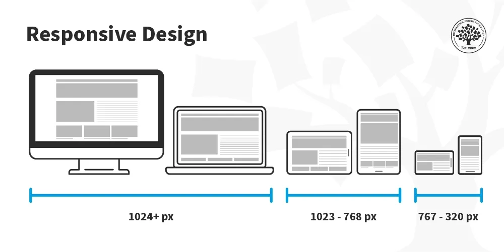
Responsive design is vital in a world where users access content on many devices. This principle ensures your product adapts effectively to different screen sizes and resolutions.
Case Study: CNN
CNN’s website demonstrates excellent responsive design. Whether accessed from a desktop, tablet, or smartphone, the website adjusts its layout dynamically, ensuring the content is always legible and the navigation remains user-friendly.
7. Feedback and Interaction

Immediate Responses
Effective feedback and interaction mechanisms are crucial in UX design. They provide users with clear and immediate responses to their actions, such as confirmation messages, error alerts, or progress indicators.
Case Study: Facebook
Social media platforms, particularly Facebook, excel in interactive feedback. User actions like posting, liking, or commenting are met with instant visual or auditory feedback, keeping users engaged and informed about the outcomes of their actions.
8. Load Time and Performance
Optimized Speed
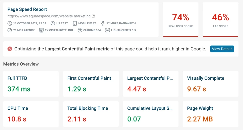
Users today expect fast load times and smooth performance. Load time and performance are critical in retaining user interest and satisfaction.
Case Study: Shopify
Shopify is renowned for its performance optimization. Its e-commerce sites maintain fast loading times, crucial for keeping user engagement high and reducing bounce rates, directly impacting sales and user retention.
9. Visual Hierarchy
Organized Content
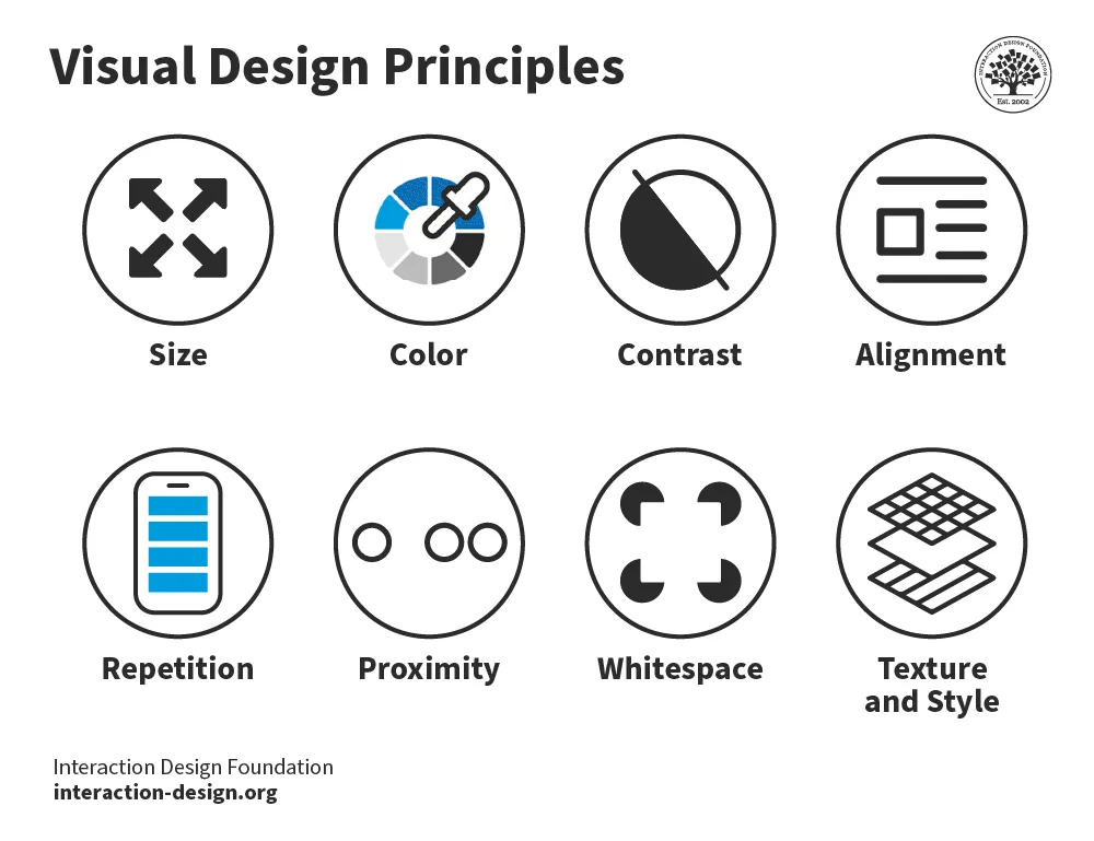
Visual hierarchy organizes content that draws the user’s attention to essential elements. This can be achieved by strategically using size, colour, contrast, and placement.
Case Study: The New York Times
News websites like The New York Times effectively use visual hierarchy to highlight essential stories. Essential news items are presented with more prominent, bolder headlines and are positioned prominently on the page, guiding readers’ attention and helping them navigate the content.
10. Testing and Iteration
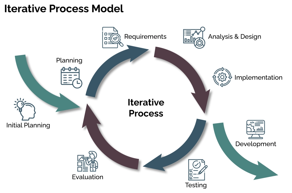
Continuous Improvement
UX design is a continuous journey that involves regular testing and iteration. Employ usability testing, A/B testing, and gathering user feedback to understand how users interact with your design.
Case Study: Airbnb
Airbnb’s commitment to iterative design is evident. The company regularly tests various aspects of its app and website, incorporating user feedback and data to continually refine and enhance the user experience.
Related Post: How to Open MDF Files in Windows
Frequently Asked Questions About 10 Best Principles of UX Design
What are the 4 C’s of UX design?
The 4 C’s of UX design are Consistency, Clarity, Compatibility, and Credibility.
What are the core principles of UX?
The core principles of UX include user-centricity, simplicity, accessibility, usability, consistency, responsive design, feedback, load time and performance, visual hierarchy, and continuous testing and iteration.
What is the golden rule of UX?
The golden rule of UX is to focus on the user. Understand their needs, behaviours, and pain points to create designs that provide value and enhance their experience.
What are the pillars of UX?
The pillars of UX are usability, accessibility, desirability, and utility.
How do you stand out in UX?
To stand out in UX, focus on deep user research, innovative design solutions, continuous improvement through testing, and maintaining a user-centric approach throughout the design process.
What makes a great UX?
A great UX is characterized by ease of use, efficiency, satisfaction, and the ability to meet user needs effectively and delightfully.
Conclusion
Adopting the ten best principles of UX design is crucial for creating digital products that are visually appealing, highly functional, and user-friendly. Remember, the journey to exceptional UX is a process of continuous learning, adaptation, and evolution. By applying these principles, you’ll be well-equipped to create digital experiences that users will love and engage with.


